Sunday, May 6, 2012

Complete Portfolio

Breadth

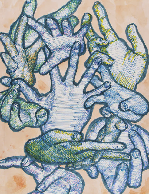
Expressive Hands, Sharpies

Retrato de Jose, Sharpies

Crooked, Curved, Power, Colored Pencils and Neil's Face

Life in Still, Charcoal, Conte, Pastel

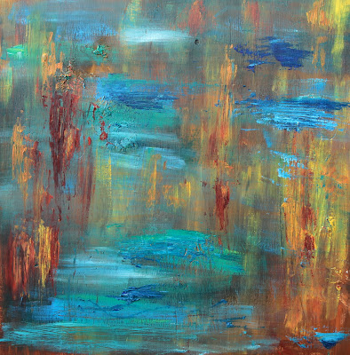
Abstract Sound, Acrylic

Geometric Faces, Pencil, Colored Pencil

Figure Drawing, Conte, Charcoal, Pastel

Galaxy Shoes, Acrylic

My Studio, Graphite

Skeleton Blah, Watercolor Blah

Self Portrait at 17, Graphite

 Concentration

Janet Jackson Melun Diptych, Photoshop and Digital Painting

Kiss Like a Virgin, Photoshop and Digital Painting

Mademoiselle d'Victoria's Secret, Photoshop

Nighthawks at Starbucks, Photoshop

Lady Gaga with the Pearl Earring, Acrylic

Detail of Lady Gaga with the Pearl Earring, Acrylic

Megan Fox Diptych, Acrylic

Statue of David Beckham, Graphite

Detail of David's Abs because they're Abs :), Graphite

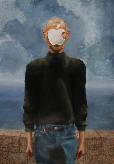
Son of Apple, Acrylic

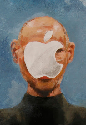
Detail of Son of Apple, Acrylic

Unforgettable, Acrylic

Van Gogh Vans for Vani, Acrylic and Fabric Medium


Saturday, December 17, 2011

Updated Work 12/17/11

Still Life in Charcoal and Conte Crayon

Self Portrait in Pencil

Crooked, Curved, Power, in Colored Pencil

Expressive Hands in Sharpie and Watercolor


Galaxy Shoes in Acrylic on Canvas Vans

Figure in Charcoal and Conte Crayon

Abstract Sund

Friday, November 11, 2011

"crooked, curved, and power" - Random Words Assignment


Photo is a little washed out, sorry. First time using colored pencils! Not that much to say about this one...it's not done, I still have tons of paper to fill in somehow. I have to draw in the hat, and I'll do that soon. I also want to work on the skintone and rounding it out a bit/adding more values. Any ideas for what I can do around it? There's a loottt more canvas space so I don't really know what to do! I think I'm gonna fill in some of his shirt.

Thanks for letting me distort your face, Neil :)

Friday, November 4, 2011

Figure Drawing


Okaaaay so...it's kind of weird. And the photo is really bad and her hair looks really red. Oh well. It's still in progress but it's basically done...it's hard working on it without the model but I tried. I don't really know how I feel about it and I kind of feel like Neil because this was painful and yeah. Does the shading look werid? In terms of contrast anyway? Cause Myles saw it and said it was good and then asked if the model was a Black Ginger. And she wasn't...

Also I've updated the still life with my more complete (but still not complete yet) piece.

Friday, October 28, 2011

Still Life (in progress - UPDATED)


UPDATE:  here's what I've done since last week. The sunglasses are still rough, and the edges definitely need to be refined but all I have left to fill in is the glass...which I'm totally avoiding. But I'll get it done.

 As you can see, it's far from being done. This is my first time seriously working in charcoal, so it's been taking me awhile and it's been super experimental. I'm really happy about how it looks now, though. The perfume bottle bothered me for the longest time because it's out of focus in the reference photo I took, but I think it works that way. I'll post more photos as I complete the piece.

Also I just noticed that the "a" on the Nutella looks a little small and it's really bothering me so I'm going to go fix that now...


edit: here's the picture i'm using for reference, just to compare

Thursday, August 25, 2011

Some Sketches

In my spare time, I often sketch portraits using photo references and it's become something that I'm very comfortable with. Here are two I've done recently that I like and have both in-progress and reference photos of. One was a gift, one was just for fun.

Drawing of Orlando Bloom, Pencils and Charcoal, 12" x 18"
 I drew this as a gift for one of my friends who wanted something to put in her room. I did it on a larger scale than I'm used to (sketchbook size) so it was difficult to expand my small-scale technique to fit the paper. However, I was impressed with my ability to do so. I didn't know how to fill the dark areas without arduously filling each portion in with small strokes of a mechanical pencil, so I experimented with charcoal and just smudged it all together. I didn't really know what I was doing. I struggled a bit with the hands and hair, but I'm satisfied with the shading of the face in comparison to the photo. Overall, the face is a bit idealized which bothers me.


Rough Sketch of Jemaine Clement, Mechanical Pencils in Moleskine Journal
 This was done in my journal as a result of too much free time and boredom. I also wanted to see how I would do drawing from a photo, and this was one of the first attempts that produced successful results. I struggled a bit with defining the hair, and now it is just one shape, but I like the marks from the pencil and variance of stroke direction and length.


Monday, August 15, 2011

Artist Research

Nick Lepard
nicklepard.com
This is Nowhere, Oil on Canvas, 2008
Understand Still, Oil and Acrylic on Canvas, 2008

Nick Lepard is a painter from Vancouver, BC. His unique style of portraiture combines photorealism with thick, heavy brushstrokes that create a surreal dichotomy between realism and impressionism. Lepard uses vivid palettes and unusual colors in unfitting places to create different textures that are almost whimsical. A few of his pieces are similar to the cubist art of the early 20th-century by masters such as Picasso and Cezanne. In his words, Lepard's art "[explores] notions of singularity, concepts of time and patterns of change". This is exhibited in his work by the different light sources, colors, and angles. In works like Understand Still, to the right, he even combines different subjects to create collage-like faces.


Jacqui Oakley
jacquioakley.com
Indigo Girls, for Atlanta Magazine, Acrylic and Ink
Illustrator Jacqui Oakley says she "[loves] unexpectedly blending patterns and textures," and you can definitely see this in her work. Her art is very reminiscent of 20th century American pop art. Most of it centers around famous figures or iconic celebrities, with the exception of commissioned pieces. Her personal portfolio includes illustrations of musicians from David Bowie to Jay-Z and Snoop Dogg. These portraits are stylized, almost cartoonish, with simple lines and vivid colors. At times, she uses limited palettes (only a few colors are used) which creates a printed effect. When comparing Oakley's rough line drawings to the painted, finished pieces, you can see the effect of the bright colors and painting technique.
Nguyen Chi Tien, for Pen International, Acrylic and Ink
Silvia Pelissero
Silvia's deviantart page
Crisp Morning, Oil Painting, 2011
 Silvia Pelissero, a painter from Italy, has a unique vivid style that combines loose brushstrokes and vivid colors. Her focus is definitely portraiture, and she uses warm and cool palettes to convey emotion through otherwise plain faces. Often times her paintings look slightly unfinished, yet this is not the case. She deliberately leaves negative space within faces and features that are unique to her paintings.
Pelissero's techniques with watercolor are truly original. Her paintings are soft yet vivid, not washed-out, and often look airbrushed.
Sheets of Colored Glass, Watercolor, Ink, and Charcoal, 2011